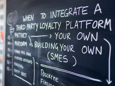
When I’m asked to audit a loyalty programme the first thing I do is open the metrics — but the second thing I do is ask who will read the report. Too often teams build dashboards for themselves: detailed, granular, and perfect for analysts. That has value. But if your goal is to convince an executive to invest more in retention or to change a pricing lever, you need a dashboard that an exec will actually read.
In this post I’ll walk you through how I build a loyalty dashboard in Google Data Studio (now Looker Studio) that gets used. I’ll share the KPIs I prioritise, how I arrange the layout, data sources that matter for SMEs, and the small design choices that increase clarity and action. This is practical stuff I use when I audit programmes or help founders set up their first reporting stack.
Start with the single question an exec cares about
Executives don’t want raw numbers — they want to know whether a loyalty programme is driving value. So frame the dashboard around a simple question such as:
Every chart, filter and metric should tie back to that. If a visual doesn’t answer the question, remove it or move it to a secondary tab for analysts.
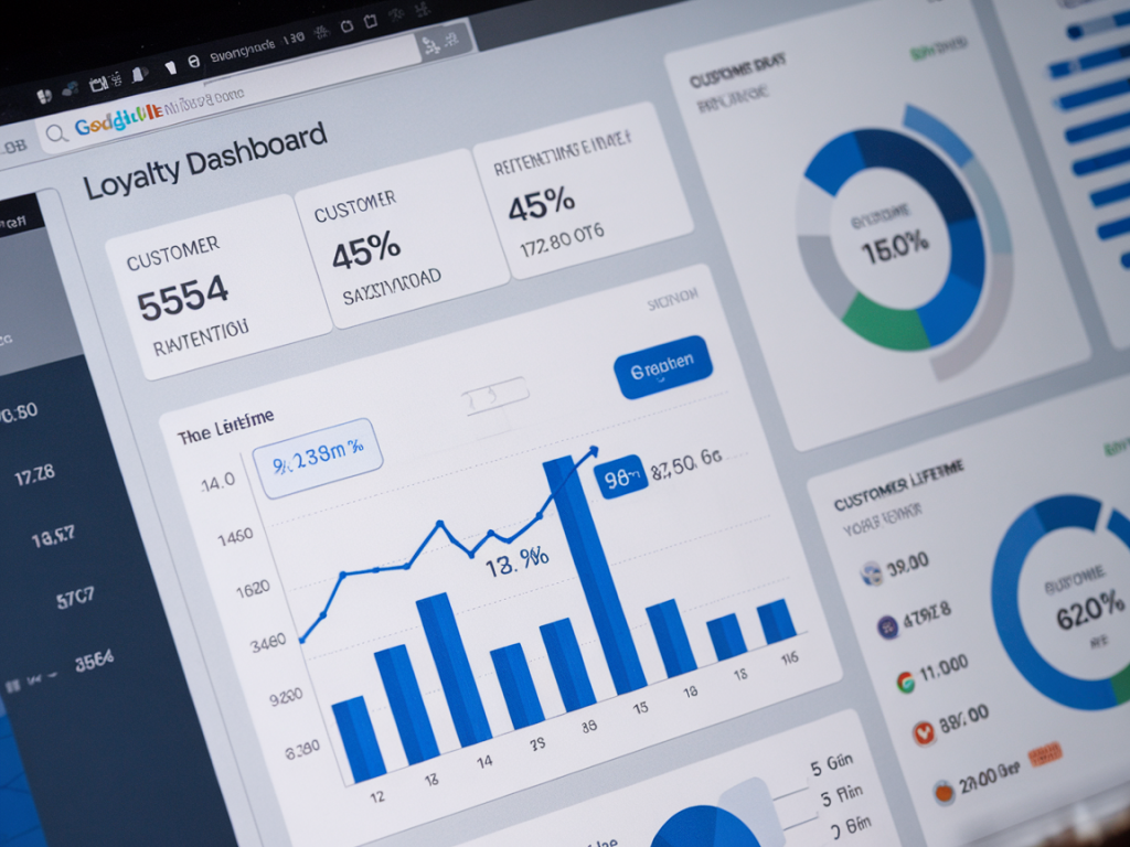
Top-row: the executive snapshot
The top of the dashboard should be dense with meaning but light on noise. I recommend a single row of 4–6 high-level tiles showing trend direction and one-period vs previous-period change. For loyalty these are my non-negotiables:
Use big fonts, clear up/down arrows, and a concise timeframe selector (last 30 / 90 / 365 days). Execs should be able to scan this row and know whether things are improving.
Second row: the story behind the numbers
Here you translate the snapshot into insight — why did the metric move? I usually include three focused blocks:
Keep these visuals simple—line charts with annotations are great. I add one sentence annotations under any major spike explaining cause (campaign, launch, glitch). That small context prevents misinterpretation.
Third row: drillable segments
Execs like to see one or two quick ways to slice the audience without opening raw SQL. Add a compact selector to let them toggle:
When they apply a filter the top-row tiles and second-row graphs should update. This lets a CFO quickly check whether “tiered rewards” are actually yielding higher LTV, or whether a channel is bringing low-value signups.
Data sources & practical connectors for SMEs
Small teams often store data across Shopify, Stripe, Mailchimp or a basic CSV. You don’t need a data warehouse to start — but you do need to be consistent about identifiers (customer email or customer_id). Common connectors I use:
If you have many transactions or want cross-platform joins, push data into BigQuery via Stitch/Fivetran or use Google Sheets as a staging layer for small volumes. The key is a single customer identifier that links orders, rewards, and emails.
Essential calculated fields
Looker Studio can do a lot of the math for you. These are my go-to calculated fields:
Avoid overly complex LTV calculations in the dashboard — do complex cohort modelling offline and surface the outputs. Execs want a clear, conservative LTV estimate rather than a cohort model with 95% confidence intervals.
Visual design rules that increase engagement
Small design choices have outsized impact:
I also add tooltips on hover with the definition of each metric (how it’s calculated and the data currency). This reduces questions in meetings.
Stories, not charts: annotations and scheduled snapshots
A dashboard that execs will read needs narrative. I add short annotations directly below charts for any major change (e.g., “Black Friday promo increased signups but reduced AOV by 8%”). For meeting prep, I schedule an automated PDF snapshot once a week and include a 2–3 bullet summary in the email. People read emails; they skim dashboards.
Common pitfalls and how I avoid them
In my audits I see the same mistakes:
Fixing these ensures the dashboard is believable and leads to better decisions.
How I roll this out with a small team
I usually split rollout into three sessions:
After that I monitor usage for the first month and remove any charts nobody uses. Dashboards should be iterated, not built once and left to stagnate.
| Metric | Why it matters | Where to get it |
|---|---|---|
| Active members | Shows engagement level | Rewards system, CRM, or Shopify tags |
| Member repeat rate | Direct signal of retention | Orders table grouped by customer |
| Member LTV | Long-term revenue impact | Aggregated orders per customer |
| Incremental revenue | Business case for loyalty spend | Experiment or matched cohort analysis |
If you’d like, I can share a Looker Studio template I use that includes the top-row layout, calculated fields and a cheat sheet for definitions. It’s a quick way to get a readable dashboard in front of your exec team and start driving conversations about loyalty as a growth lever.